In the years between 1967 and 1990, multiple hypertext systems have been successfully realised and developed within different environments. Educational and scholastic purposes as well as end-user optimised products with user programming and digitisation of archives are examples. A representative selection will be introduced in this section. What sets them apart from the World Wide Web is that they were running on local devices or networks, so the content only got shared and edited within small user groups.
Hypertext systems tend to think of information as nodes (concepts) connected by links (relationships). They will have a way of editing and managing both the nodes and the links. They are usually complete systems which hold all the nodes and links in a robust database.
Learn More
Women in Hypertext
The young discipline of hypertext was heavily populated with women. Nearly every major team building hypertext systems had women in senior positions, if not at the helm. At Brown University, several women, including Nicole Yankelovich and Karen Catlin, worked on the development of Intermedia.[...]Amy Pearl, from Sun Microsystems, developed Sun’s Link Service, an open hypertext system; Janet Walker at Symbolics singlehandedly created the Symbolics Document Examiner, the first system to incorporate bookmarks, an idea that eventually made its way into modern Web browsers.
Other Hypertext Systems
HES, 1967
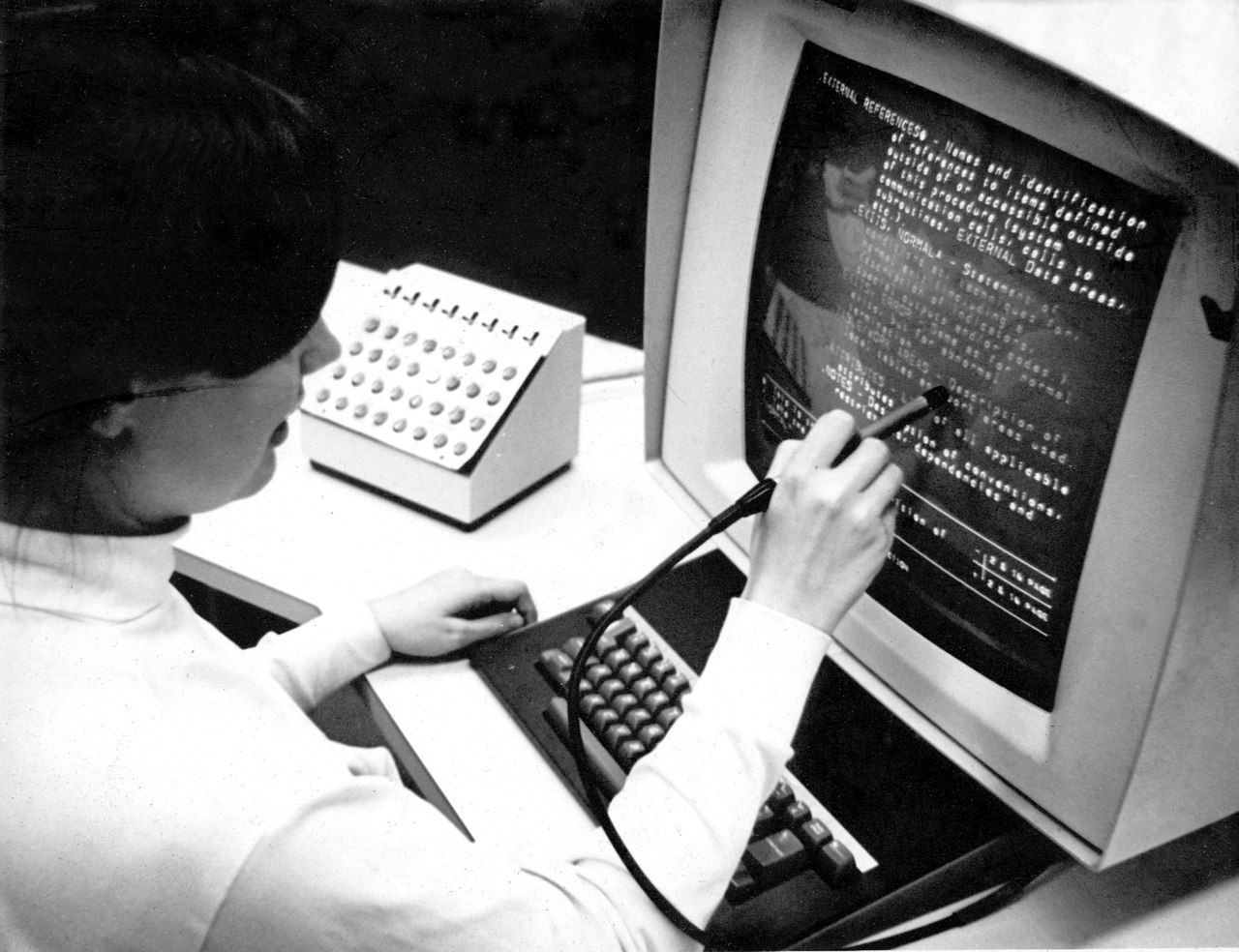
The Hypertext Editing System was developed by Andries van Dam and his students at Brown University, with a lot of input from Ted Nelson. It ran on the campus mainframe computer, which at the time was a very valuable resource, worth several million dollars and filling up a whole room. Van Dam’s Team was able to use the machine as a “personal computer” between midnight and 4 AM. (Brown CS: A Half-Century Of Hypertext, n.d.)
It was the first hypertext system ready to use for novices and pioneered the ‘back’ button. Later NASA used it for the documentation of the Apollo space program.
Links were conceptual bridges, shown on screen as asterisks: one at the point of departure, one at the arrival point somewhere else.
oN-Line System, 1968
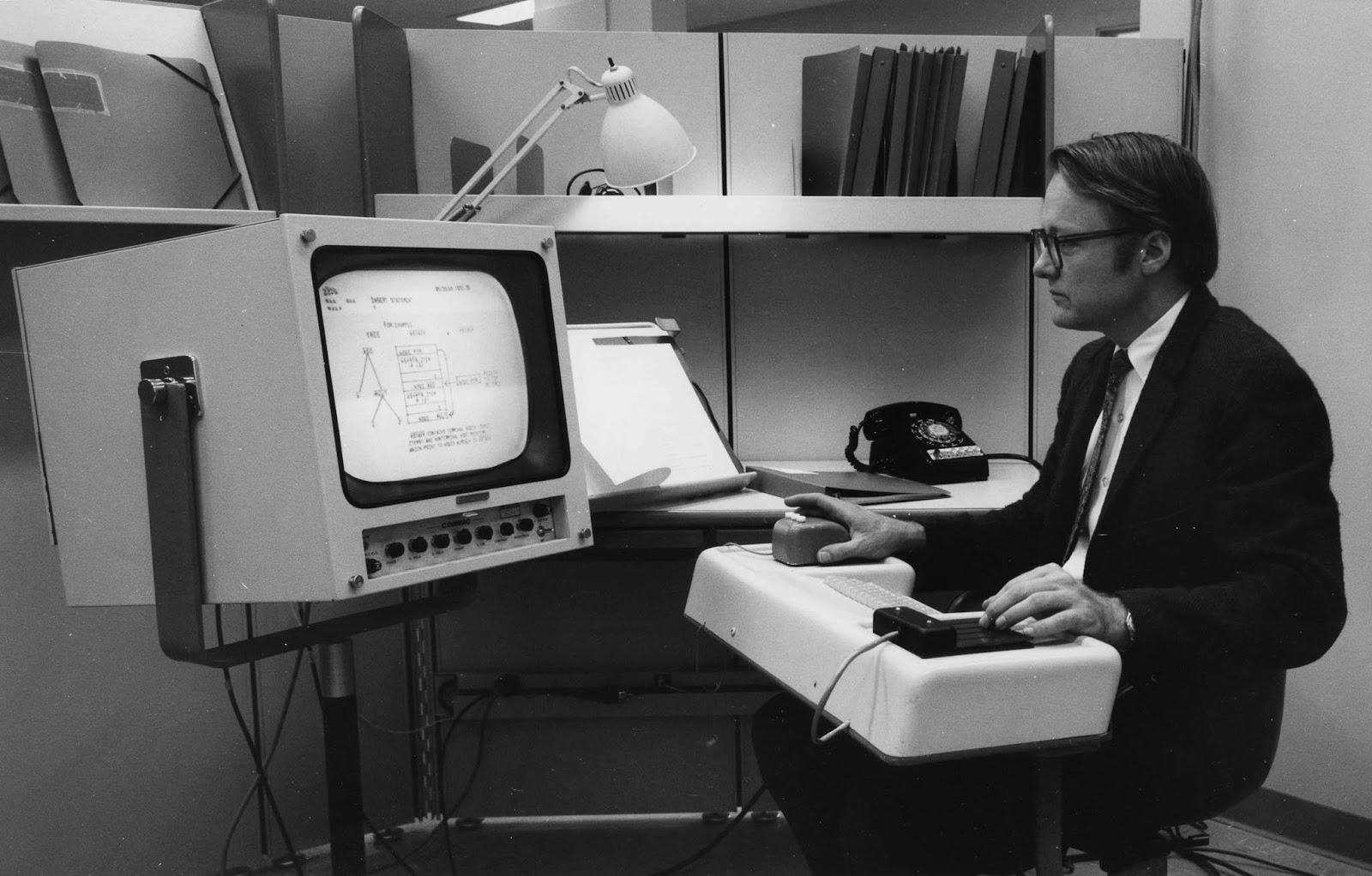
The oN-Line System or short NLS was developed by Douglas Engelbart at the Stanford Research Center, with the intention to provide a tool to sharpen human intelligence to solve the world’s problems. Its presentation in 1968 would go down in history as “The Mother of all Demos”. Inspired by Bush’s article as a soldier in the cold war, Engelbart dedicated his life to information systems, organising and providing easy access to human knowledge.
In 1968, he used his “Mother of All Demos” to show a conference audience an extraordinary array of revolutionary functionality, including windows, simple line graphics, dynamic linking, text and outline processing, video conferencing, and real-time collaboration.
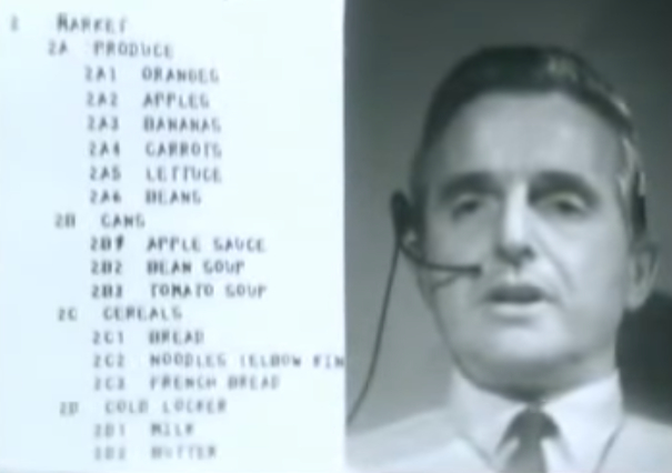
In an impressive one and a half hours, Engelbart and his team demonstrated through a live video conference how the “intellectual worker” in the future would use the computer. The presentation seems so familiar, because many of the then brand new technologies have been translated into our modern day GUIs. Next to the most remembered invention, the mouse, the system featured windowing, electronic documents with hierarchical hypertext trees and simple drawings.
It featured links, for example, to display the full meaning of an abbreviation, displayed under a dotted line below the ‘main’ content upon clicking the short form. From what I can see in the demo, links weren’t signalised in a special way, and were called ‘hidden links’. Simple line diagrams were used to show structural document setups.
Learn More
FRESS, 1968
FRESS or the File Retrieval and Editing System was a hypertext system that was built on the previous HES system, also developed by Andries van Dam and students at Brown University. It aimed to incorporate some of Douglas Engelbart’s best ideas from NLS.
FRESS, which first took its name from the Yiddish verb for a gluttonous eater (it used 128 of the mainframe’s 512 kilobytes to run as a time-shared service)
It could use multiple tiled windows, displayed in a WYSIWYG editing environment and implemented one of the first virtual terminal interfaces, that allowed users to log into the system from independent devices. Interactions would be controlled with a Light Pen and corresponding foot pedal.
From the beginning we wanted FRESS users to be both readers and writers, consumers and authors
FRESS word processing already made use of Autosave and pioneered the soon-to-be-essential ‘undo’ feature (Barnet, 2010).
It’s critical because it takes the fear of experimentation away. You can always just undo it.
There were two types of bidirectional links, one used to tag/structure, displayed as “%keyword%”, and the other to jump “%%J” between documents. Links as well as text blocks could be marked with keywords, which in return could operate as a content filter.
A table of contents and an index of keywords would be generated automatically. Additionally, it featured an editable structure space visualisation, that would auto update the edited links.
Links were displayed as ‘markers’ that could be listed next to the text, including a little teaser that would summarise the reference. Opening one of the links would then open the referenced content next to the ‘original’ text.
Some of Ted Nelson’s ideas were incorporated into FRESS, but he distanced himself from the project, as he was disappointed by technological limitations holding back his full vision and van Dam’s pragmatic approach.
Ted was a philosopher, and he wanted to keep hypertext pure.
The team’s focus on word processing (FRESS even was used to format and typeset quite a few books) went strictly against Ted’s belief that hypertext shouldn’t be printed.
We learned that students gain a tremendous amount of insight from having vast amounts of information at their fingertips.
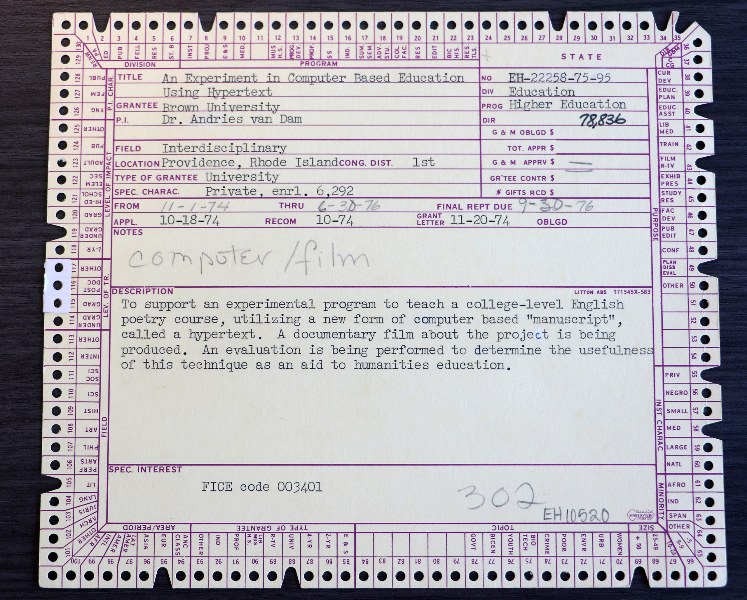
FRESS was used as an educational system at Brown, most notably tested as such in the course “Introduction to Poetry” in 1975 and 1976, which was accompanied by a documentary crew and even tested with a comparison group that didn’t use the system.
compared to a control group that took the course in a traditional setting, the FRESS users attained a deeper understanding of the material and higher satisfaction with the course. On average, students using hypertext wrote three times as much as their computerless counterparts.
Using the valuable campus mainframe computer for the humanities was thought to be improper use by many. Still, Van Dams’ team implemented the course material into the system, the poems in question and additional content that place the poem in context.
Students could use the Light Pen and keyboard to add comments or questions directly to the text and with that form a discussion within FRESS with their classmates and professors.
There was no fancy typeface to give the appearance of professional heft. As a result, students weren’t intimidated by or overly reverent of the professional critics.
“I really believe that we built the world’s first online scholarly community,” van Dam said in an interview. “It foreshadowed wikis, blogs and communal documents of all kinds.”
Learn More
Note Cards, 1984
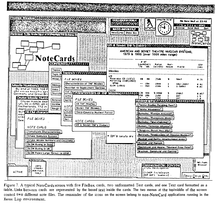
Hypertext-based personal knowledge system, developed by Randall Trigg, Frank Halasz and Thomas Moran and co-designed by Cathy Marshall at Xerox PARC. It was a major influence on Apple’s HyperCard.
NoteCards is an extensible environment designed to help people formulate, structure, compare, and manage ideas. NoteCards provides the user with a “semantic network” of electronic notecards interconnected by typed links.
Each window is an analog of a cue card; window sizes may vary, but contents cannot scroll. Local and global maps are available through browsers. There are over 40 different nodes which support various media.
Links are represented as boxes around the linked text.
organizing and structuring, sketching outlines, and maintaining references. Building connections and viewing them globally helped writers work through their arguments and ideas, and since NoteCards allowed multiple arrangements to exist in parallel, writers could explore various interpretations before settling.
Xerox PARC was an ideal environment to work on hypertext, as it was a very multidisciplinary campus, with anthropologists, linguists, physicists and computer scientists working alongside one another “on a terraced campus built into a wooded hillside overlooking Silicon Valley”. They even offered an Artist-in-Residence Program “which paired artists with technologists to create ambitious new media works.”
Many revolutionary innovations originated there, such as the first personal computer with a mouse driven GUI (Graphical User Interface), the desktop metaphor, laser printing and Ethernet.
Learn More
Intermedia, 1985
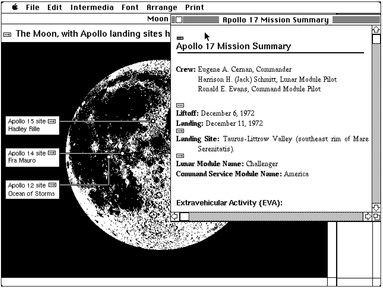
As the third major hypertext system originating at Brown University, Intermedia was housed at the Institute for Research in Information and Scholarship or IRIS. It was initiated by Norman Meyrowitz and offered a set of integrated tools and electronic material for students to do scholastic research, on a network of connected computers on campus. In contrast to FRESS, it didn’t just provide a WYSIWYG word processing environment but offered a whole multi-window set of applications.
As its name suggests, Intermedia was plural: it included InterText, a word processor, InterDraw, a drawing tool, Interpix, for looking at scanned images, InterSpect, a three-dimensional object viewer, and InterVal, a timeline editor. Together, these five applications formed an information environment, a flexible housing for whatever corpus of documents a scholar might want to consult.
The integration of many formats, like 3D visualisation tools, marks it as a collaborative hypermedia project. It wasn’t just a staff-fed database but should act as a research platform and base for new ideas through connections points of data.
IRIS designed its hypertext system, Intermedia, from the viewpoint that creating and following links should be an integral part of the desktop user interface metaphor invented by Xerox and popularized by the Macintosh. The cut-and-paste metaphor was a key part of the early Mac experience, and Intermedia put it to good use in its treatment of linking.
All kinds of documents, texts and graphics within the system could be linked together bidirectionally, tagged, filtered and edited again by another user. Links were represented with a link marker as little boxed arrows in superscript and would adapt if one of the anchors moved, to avoid link breakage. To make a link one would select the anchor object, open up a context menu and ‘start link’, then navigate to the desired reference point and ‘complete relation’. If multiple possible links are deposited, a little pop-up window will offer the selection of all possible directions to go.
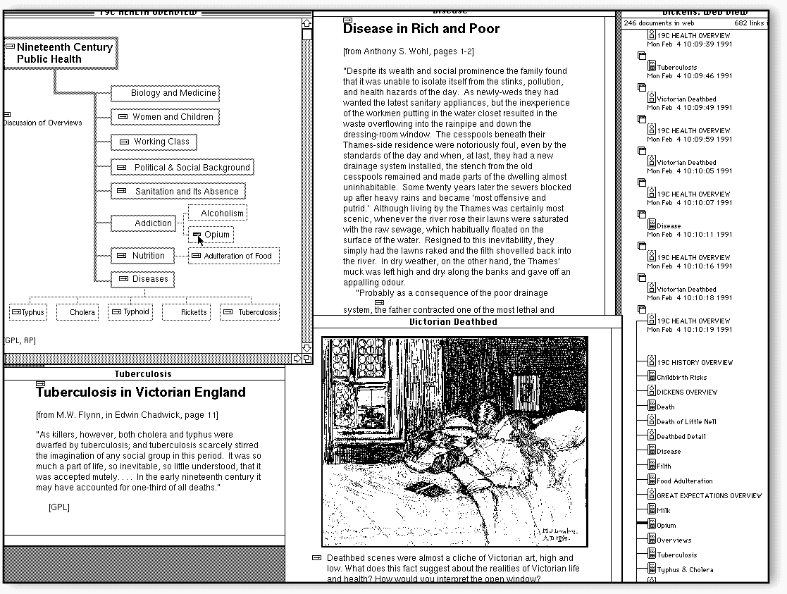
Linkages weren’t connected with the source material but stored in an external database, leading to an ever-growing ‘personal web’ of connections. Additionally, users could set ‘paths’ as predefined routes through certain documents, close to the idea of Bushes’ trails. With a ‘splice’ selected material could be compiled to be printed together, for example. Full-text search, browsing history and link-map visualisations called ‘plex’ were part of the system as well.
Again the Brown faculty were asked for concepts of educational experiments with the system, which were implemented for a pilot semester in multiple courses, like cell biology and English literature. Those were recorded for a documentary, including student interviews.
Next to the generally very positive feedback some of the critique points by students using the system include performance as the system was quite slow at times or crashed. Other students felt like they cheated, as connections were already provided by other students - working ‘together’ and without the books felt wrong to them.
Learn More
HyperCard, 1986
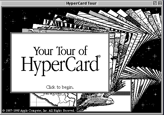
HyperCard was a hypermedia system running on Apple Macintosh, created by Bill Atkinson. It was one of the first commercially used and widely successful hypertext applications with a big audience.
Reminiscent of Otlet’s index cards and ‘inspired’ by Xerox PARCs NoteCards, this system provided users a very open environment to build their own hypertext card ‘stacks’. Opposite to the index cards they were not just referring to the desired document, but are carriers of the main content themselves. Information was spread on cards that were interconnected through buttons, links and indexes. It linked a database with an editable graphical interface and was a very popular tool within education and in adapted uses like office manuals.
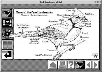
Links were mostly displayed through rounded box buttons as ‘hot spots’ that caused something to happen once clicked. They could link to the next card (as arrows) or stack, cause visual effects or play sounds. There also could be ‘hidden’ buttons, for example within graphics.
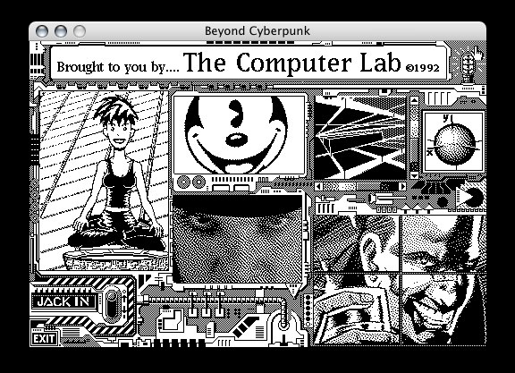
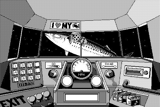
HyperCard content could be shared on floppy disks, so it was possible to buy readymade stacks. It was used as an Address Book, Calendar, To Do list, to play piano notes, as a presentation program (pre PowerPoint) and even for small adventure games, most famously Myst. It came with plenty of templates and graphics ready for use. Images could be scanned as bitmaps and added to HyperCard.
HyperCard as a visual drag-and-drop editor was very easy and intuitive to use. Still, there was the possibility to customise it even further by using HyperTalk, a built-in programming language. It is said to have been an influence on the web as it inspired two key technologies of the Web, HTTP and JavaScript as well as the pointing-finger cursor.
Learn More
Microcosm, 1988
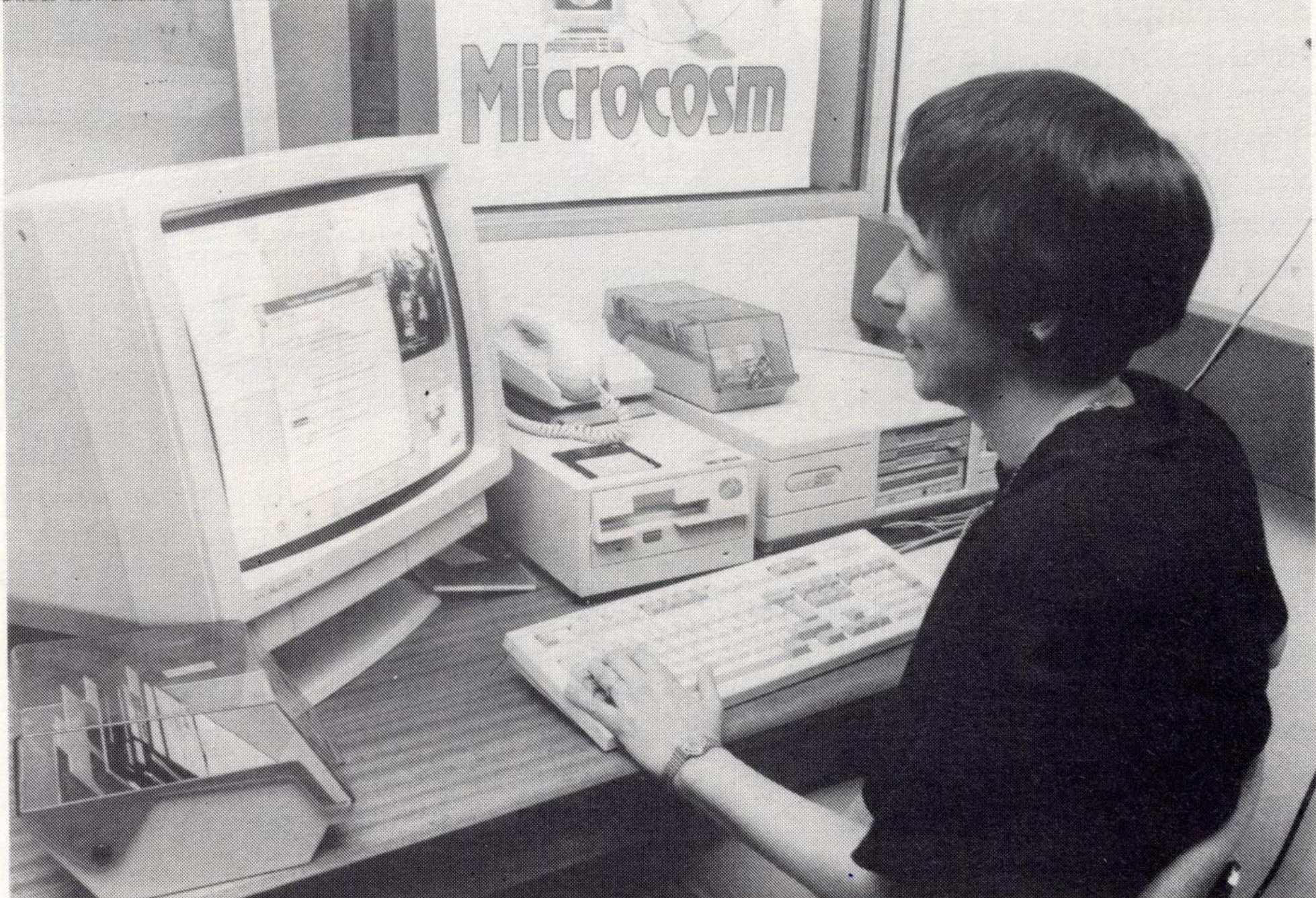
Microcosm was developed by the Department of Electronics and Computer Science at the University of Southampton and is based on the Mountbatten archive.
the library inherited some fifty thousand photographs, speeches recorded on 78 rpm records, and a large collection of film and video. There was no linear sequence to the material, save chronological order, and no hope of fitting it neatly into a database.
It was implemented by a team of researchers around Wendy Hall, who could be seen as one of the female key figures in the hypertext world. Because it holds so many different forms of media it could be categorised as a hypermedia system, rather than just hypertext.
“The archivist came to see me,” Wendy remembers, “and he said, ‘Couldn’t we do something wonderful? I’ve got this multimedia archive, it’s got pictures, it’s got film and it’s got sound. Couldn’t we put it on a computer and link it all together?’ And that was the beginning.
Links are highlighted through bold formatting as ‘buttons’ and multiple links can be offered on click.
‘Micons’ as in ‘moving icons’ can be used as a representation of links for videos. Audio can be linked within the document. The idea of trails or ‘guided tours’ through the content are represented and are called ‘Mimics’.
Microcosm’s core innovation was the way it treated links. Where the Web focuses on connecting documents across a network, Wendy was more interested in the nature of those connections, how discrete ideas linked together, and why—what we would today call “metadata.” Rather than embedding links in documents, as the Web embeds links in its pages, Microcosm kept links separated, in a database meant to be regularly updated and maintained. This “linkbase” communicated with documents without leaving a mark on any underlying document, making a link in Microcosm a kind of flexible information overlay, rather than a structural change to the material.
With this structure Microcosm really put an emphasis on the connections and relations between documents, instead on the document itself.
